Explore my portfolio
I’m passionate about turning data into beautiful, meaningful visuals that tell a story that helps connect knowledge to action.
Maps
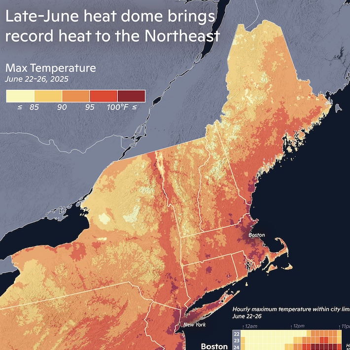
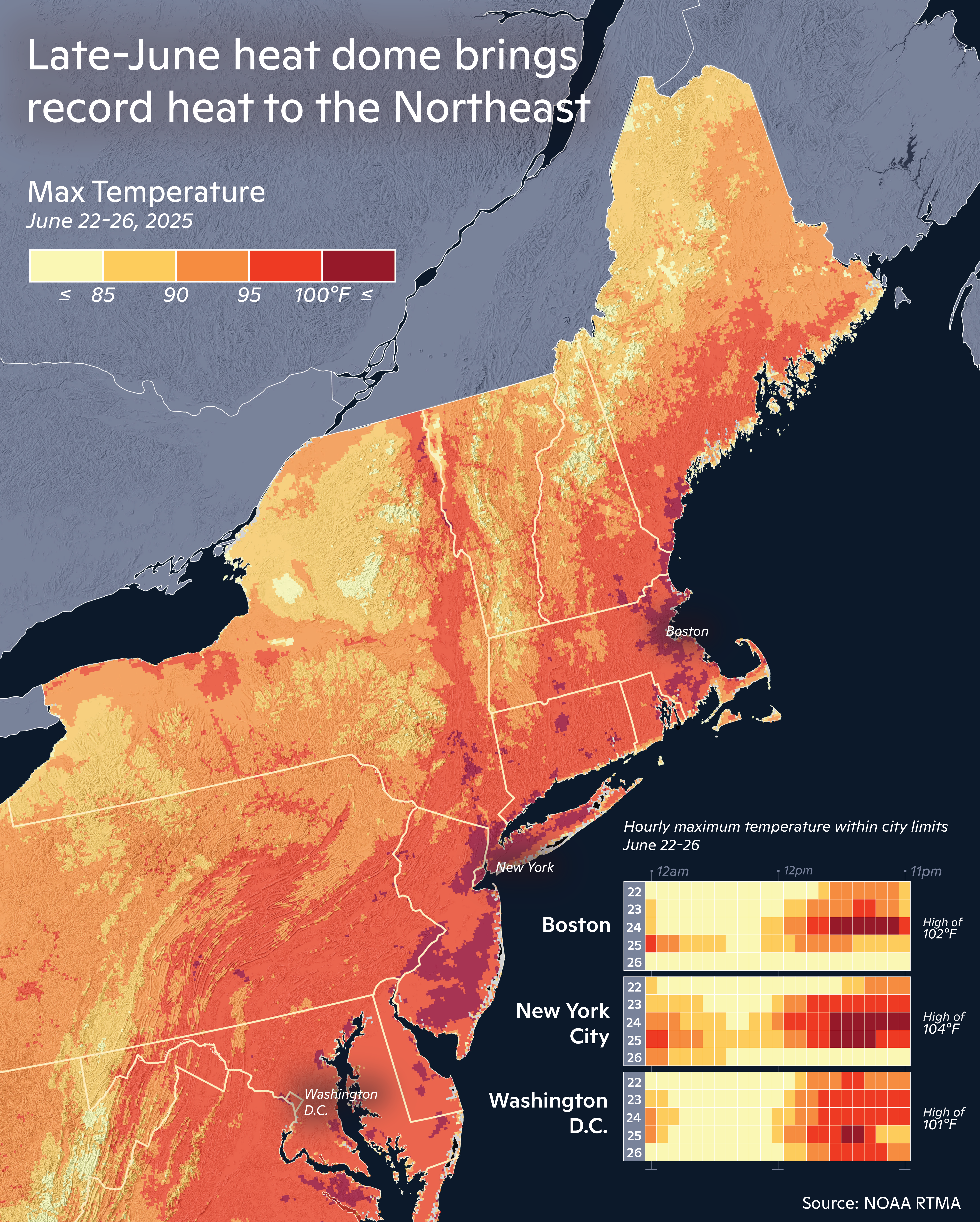
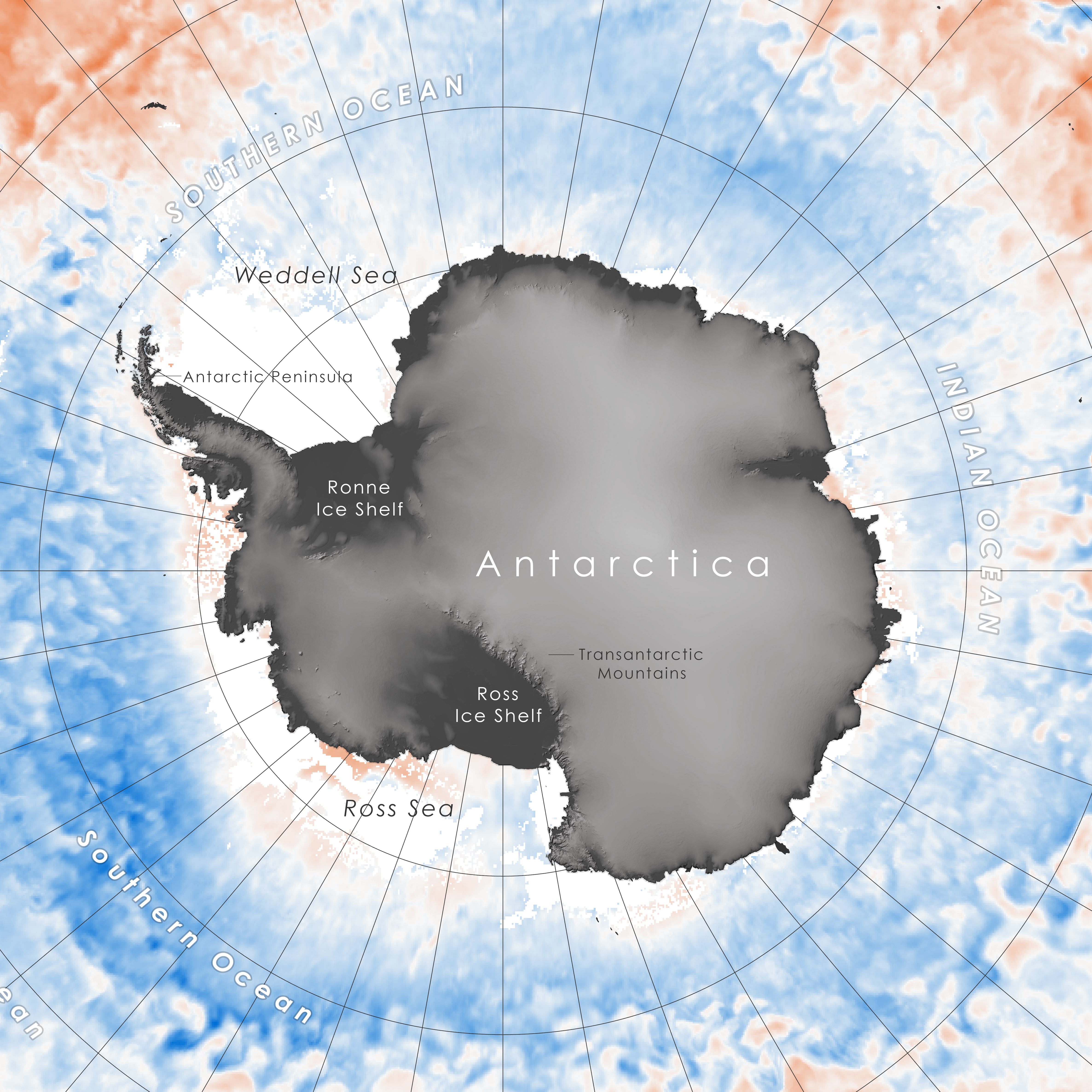
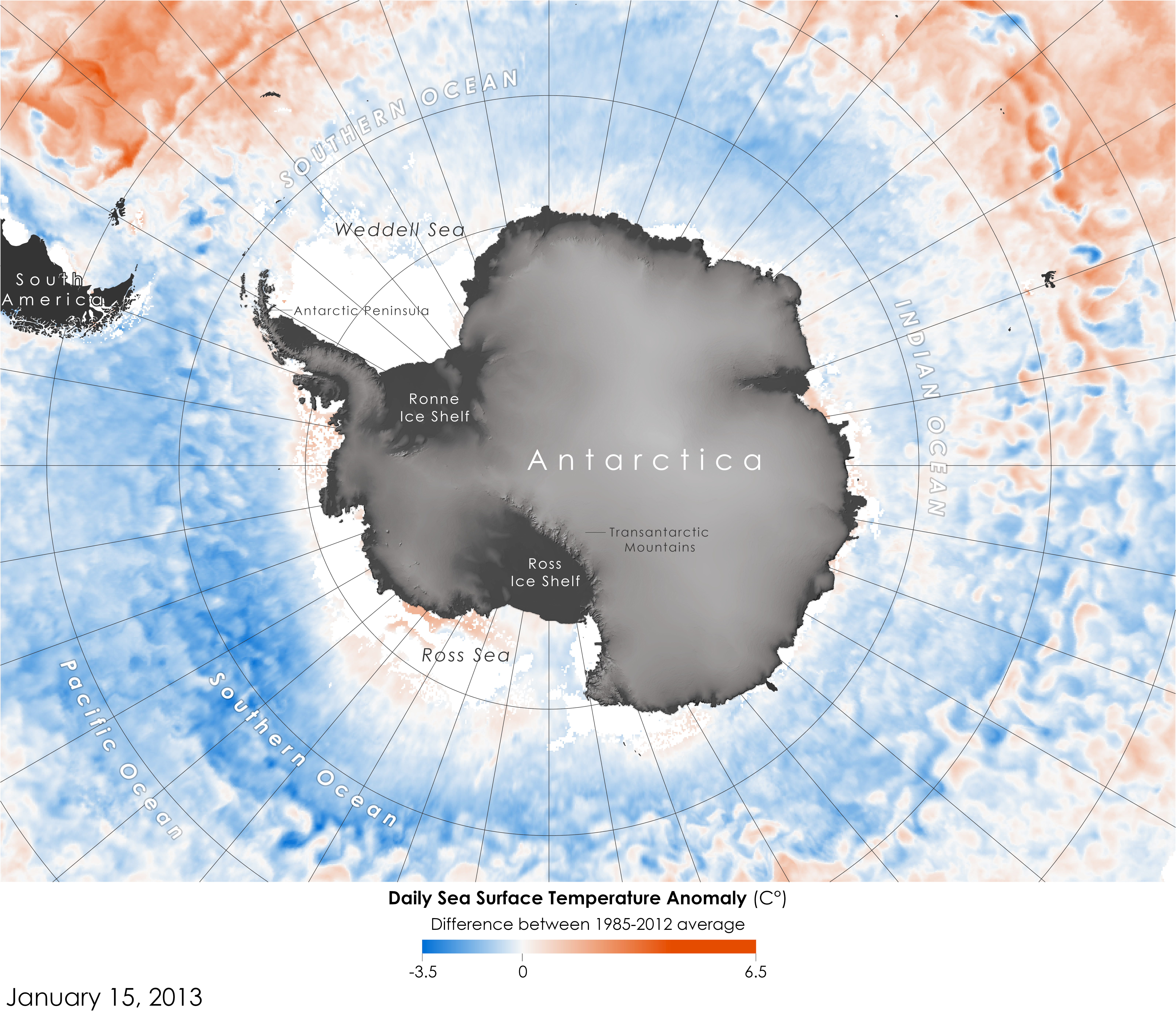
Created for Woodwell Climate Research Center. Data accessed via Google Earth Engine, map designed in ArcGIS Pro, graph designed in R-Studio, final formatting in Adobe Illustrator.
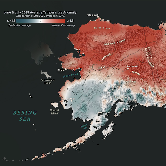
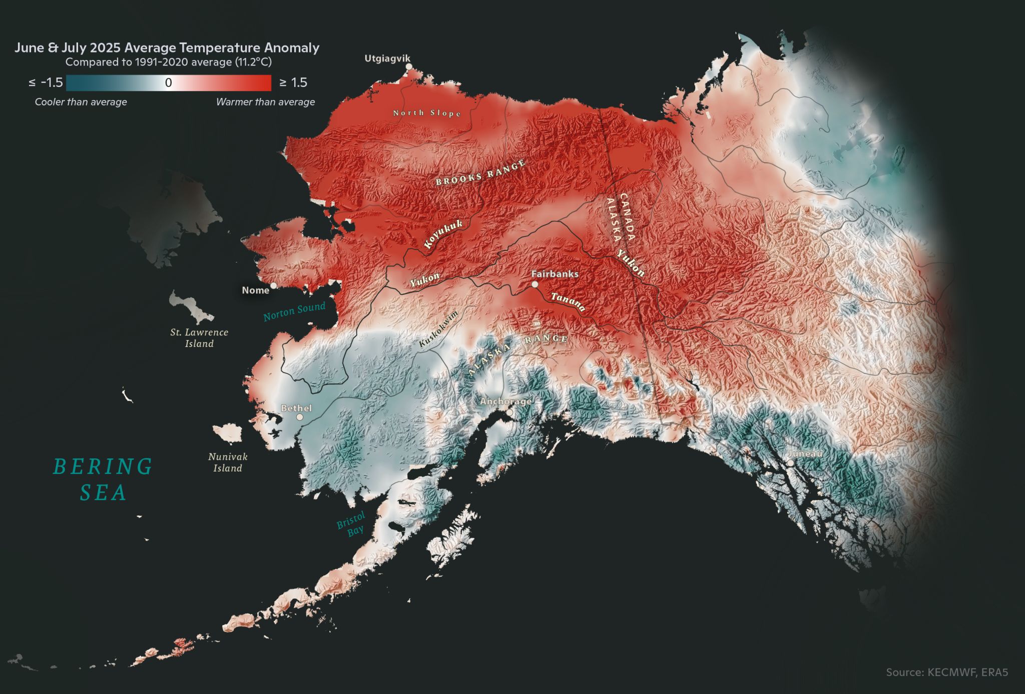
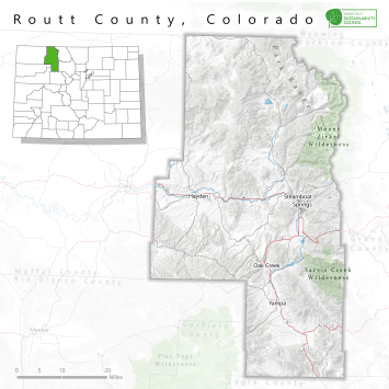
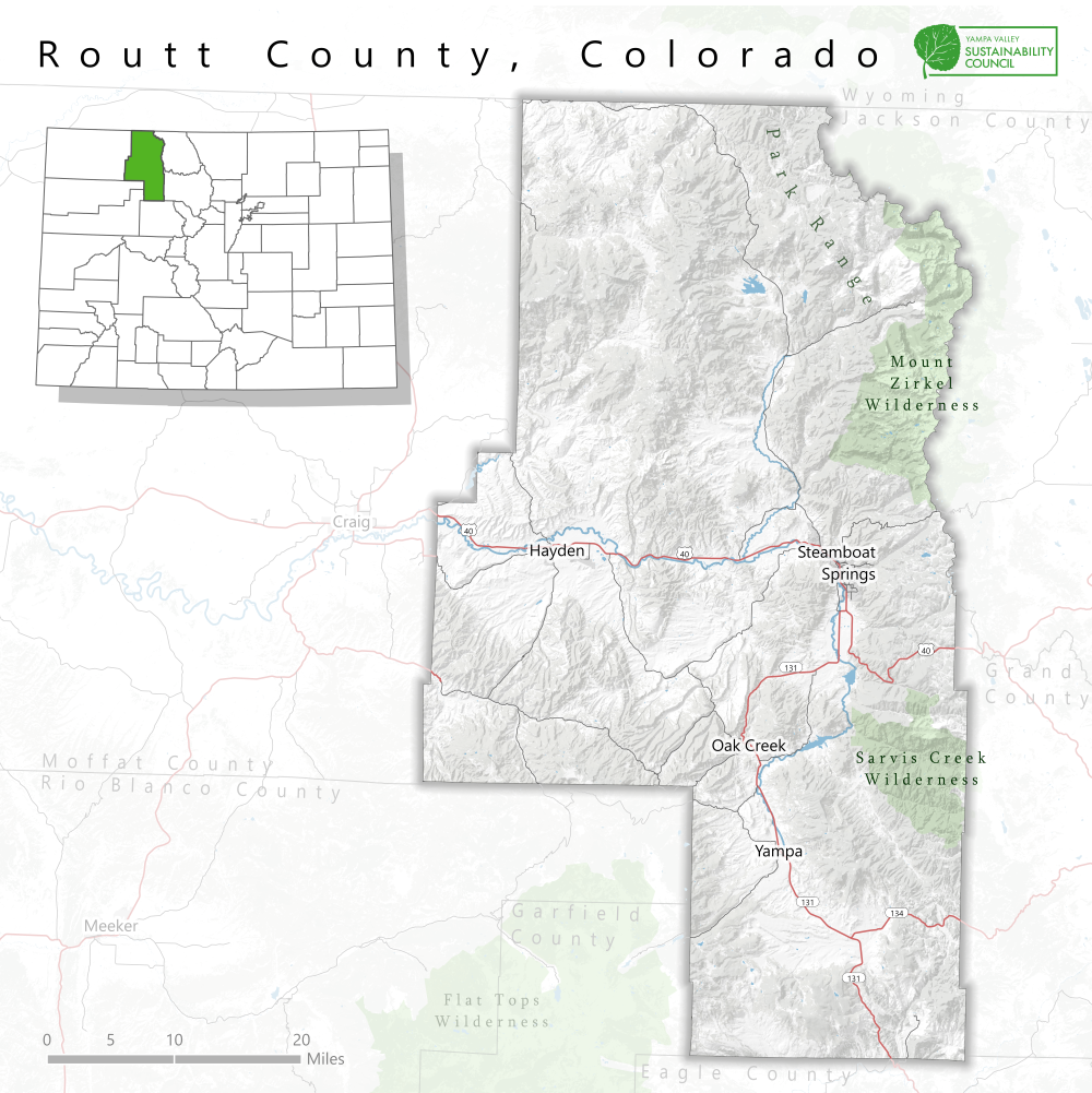
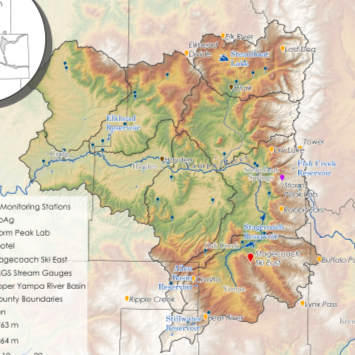
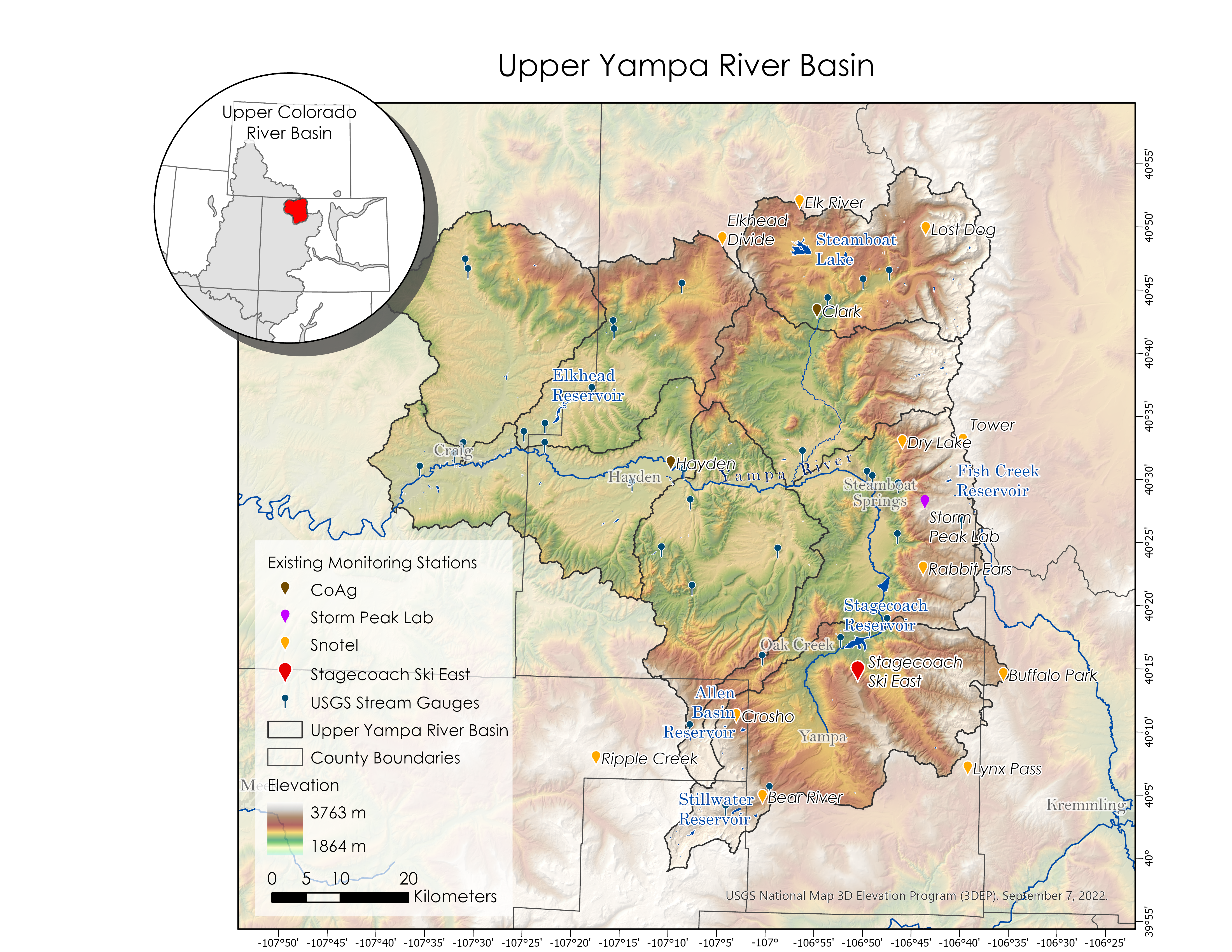
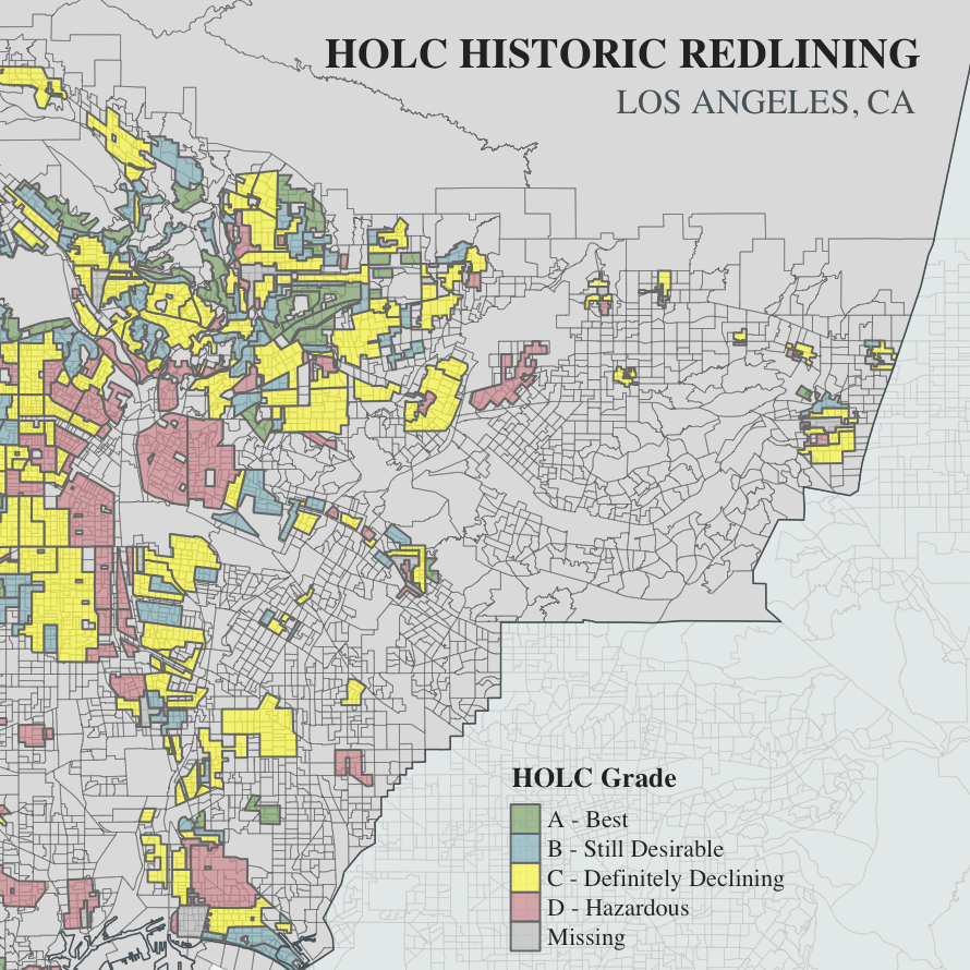
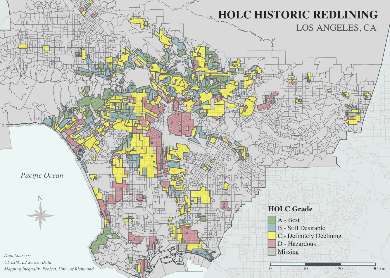
Created for Woodwell Climate Research Center. Map designed using ArcGIS Pro and Maps for Adobe.
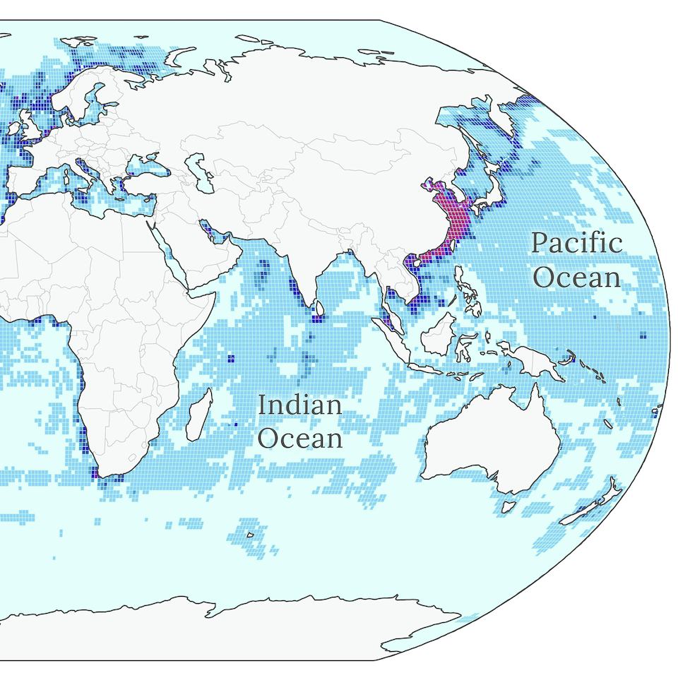
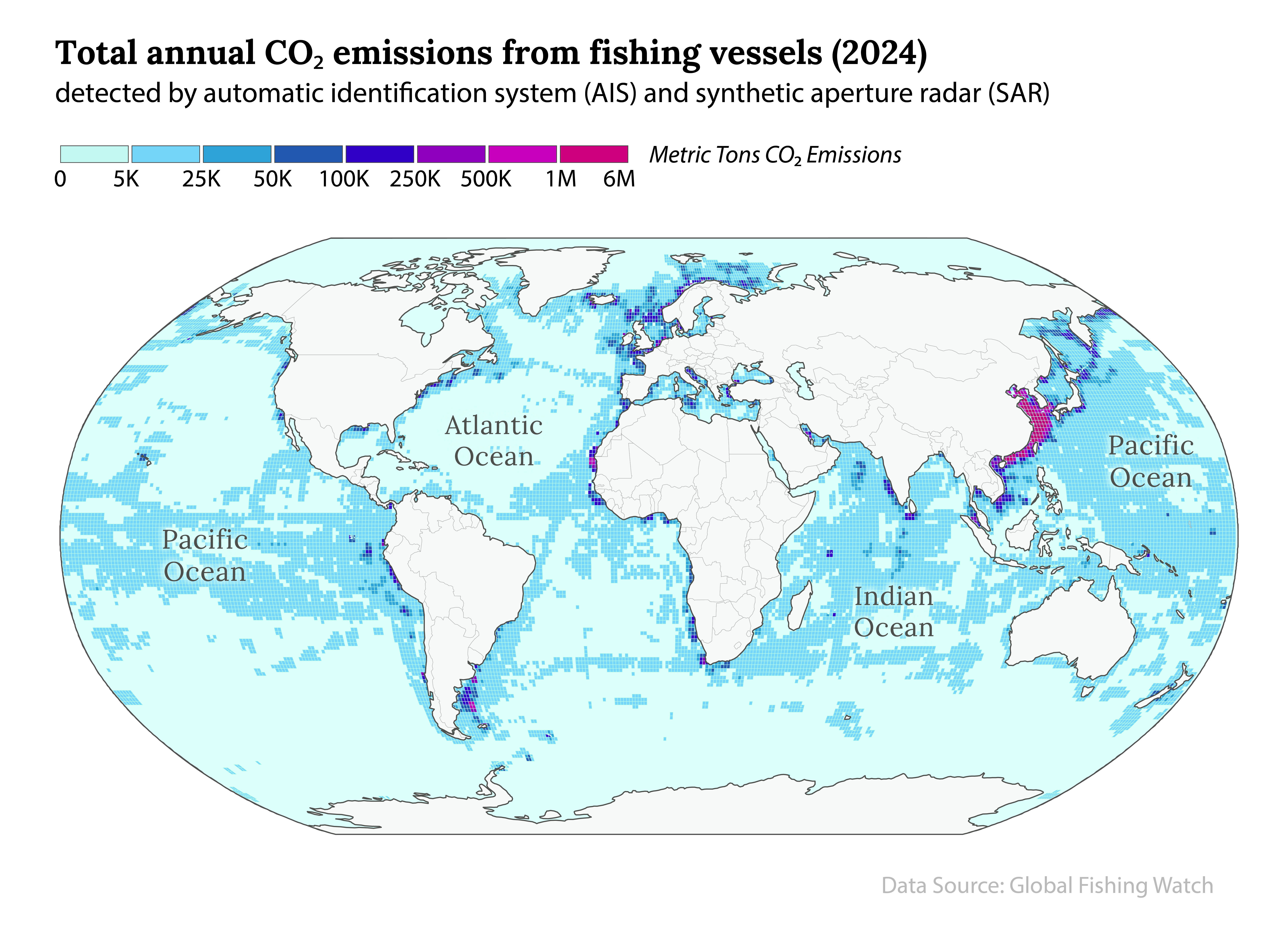
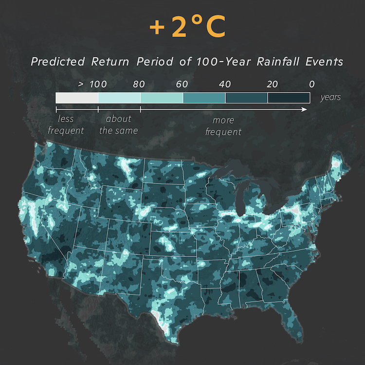
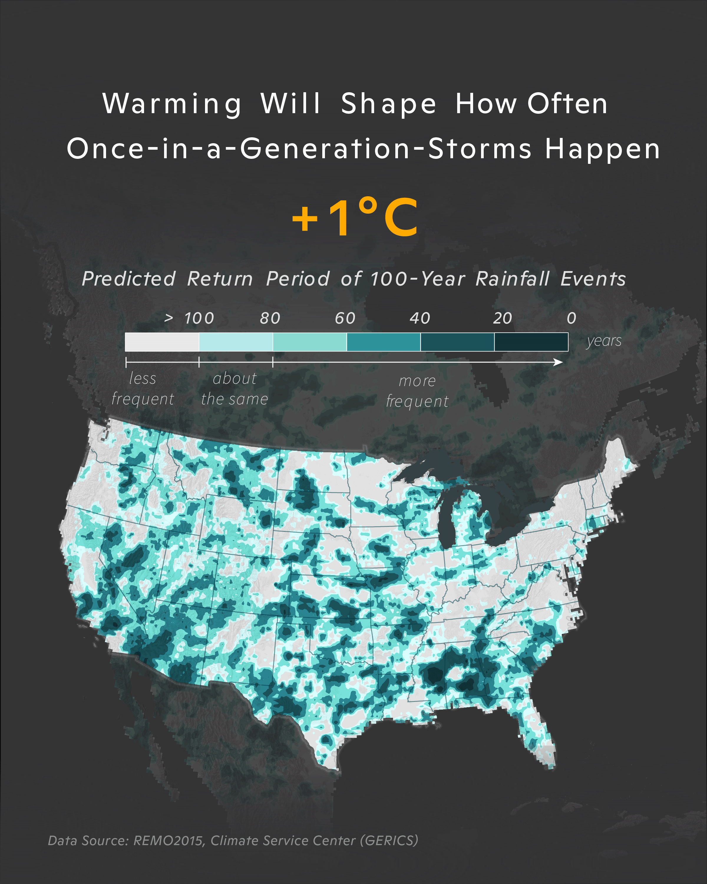
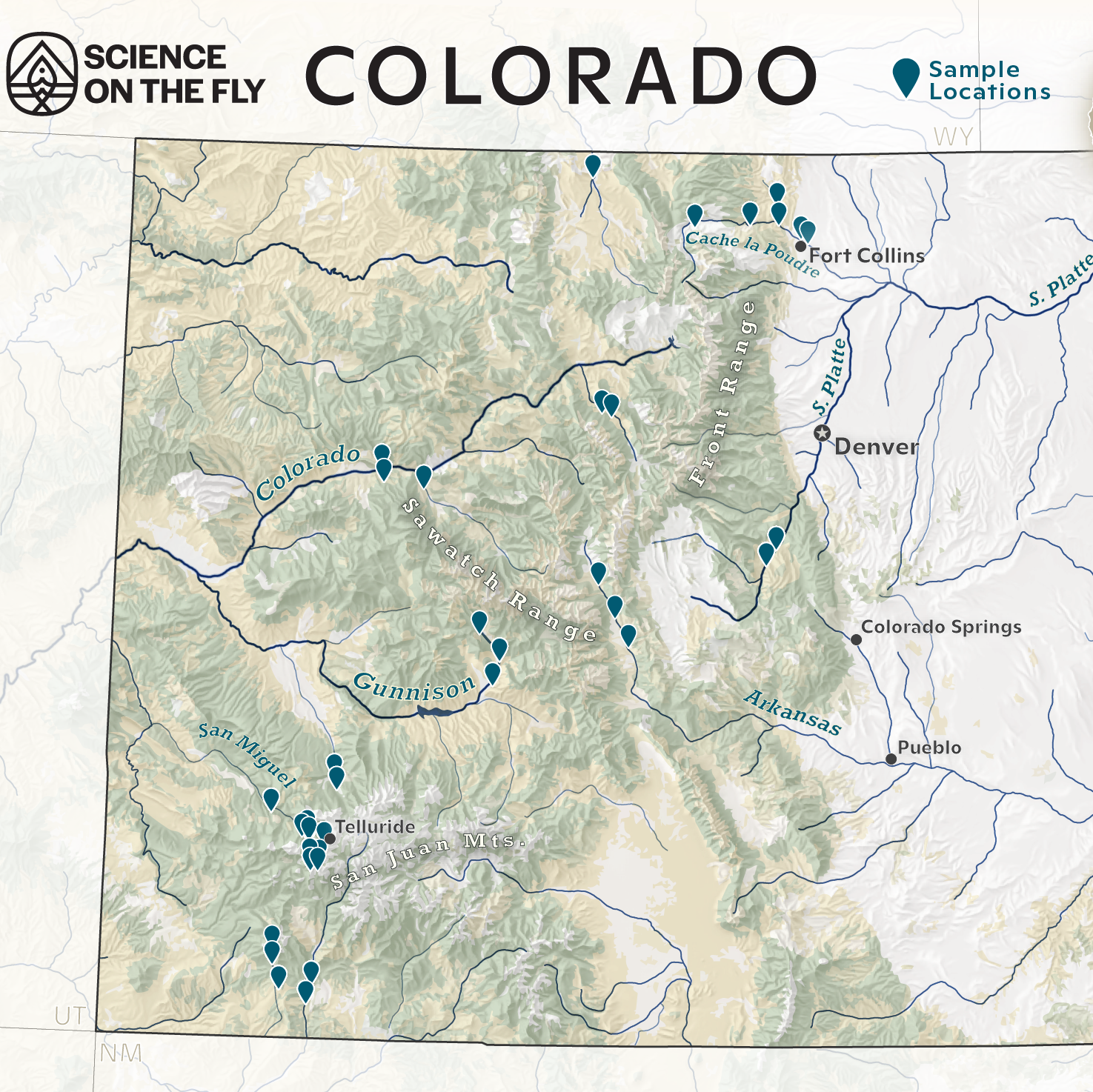
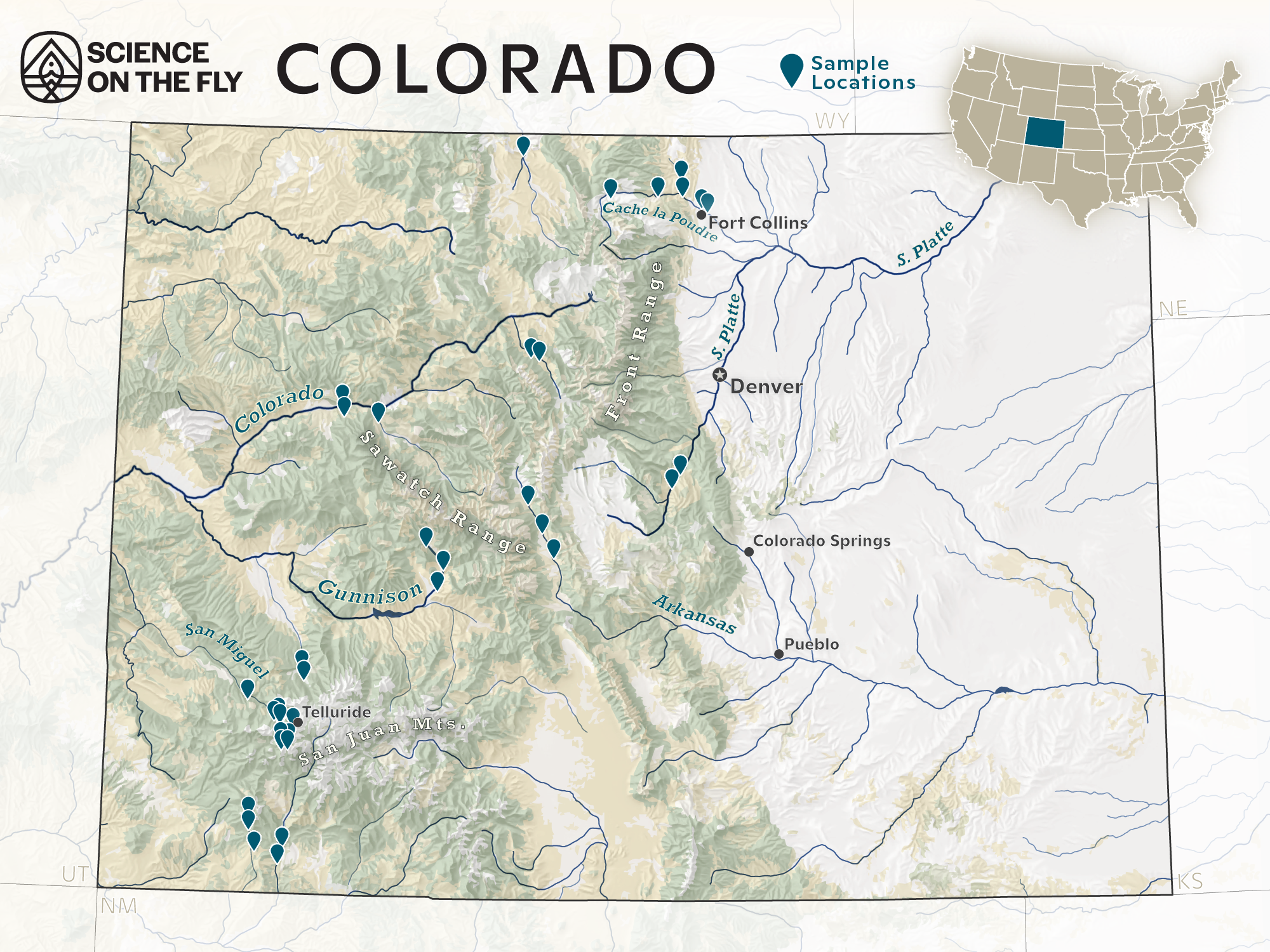
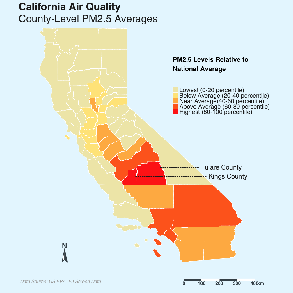
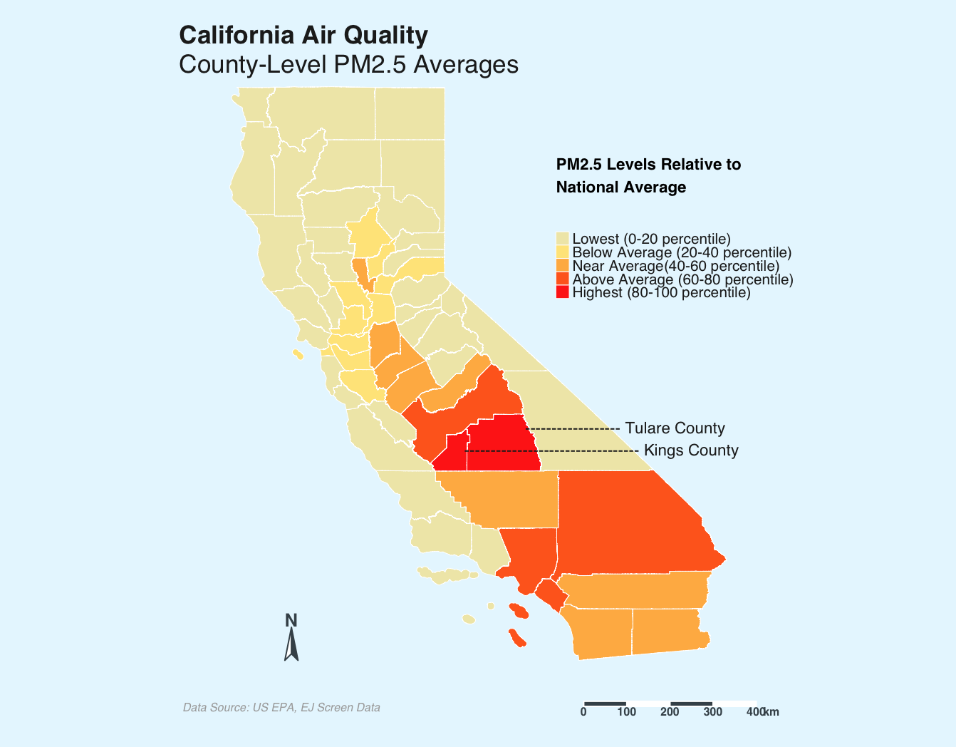
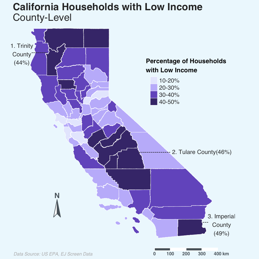
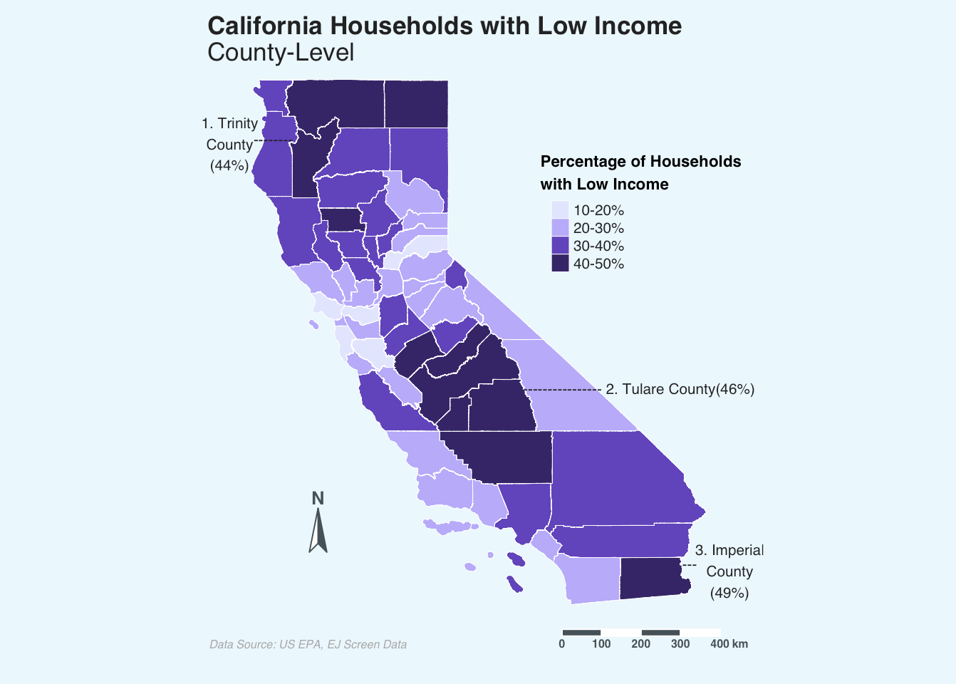
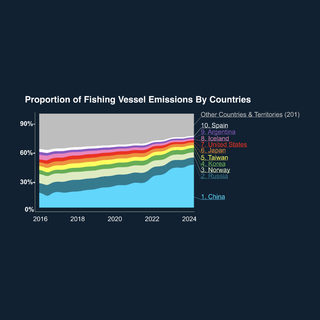
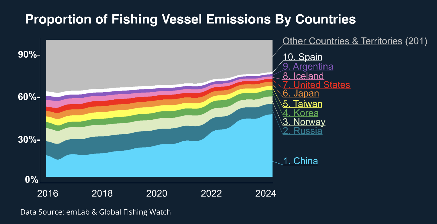
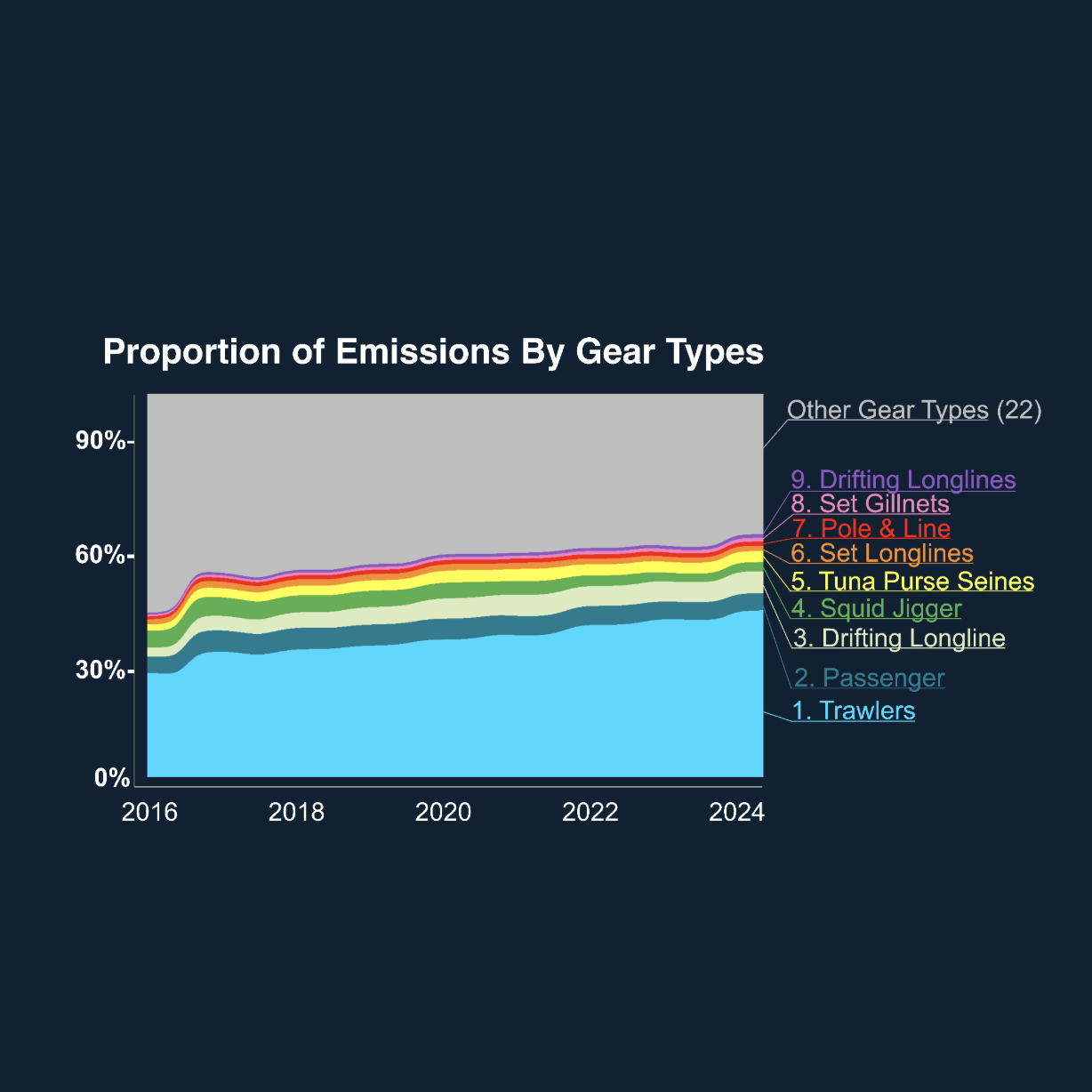
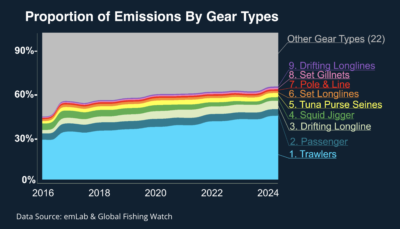
Created for Environmental Markets Lab (EmLab). Data accessed via Google Earth Engine, map designed using MAPublisher.
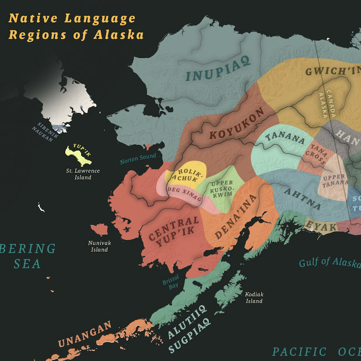
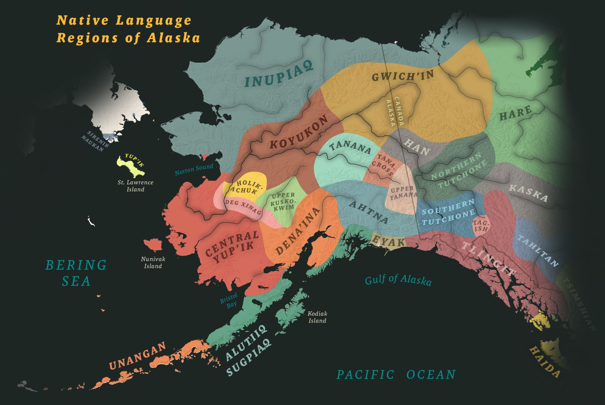
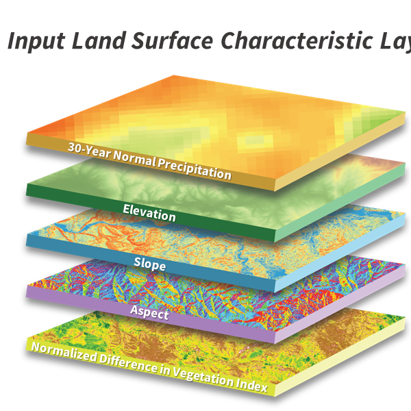
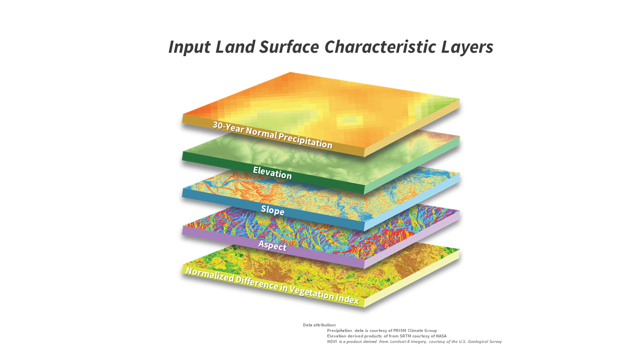
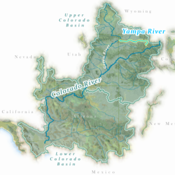
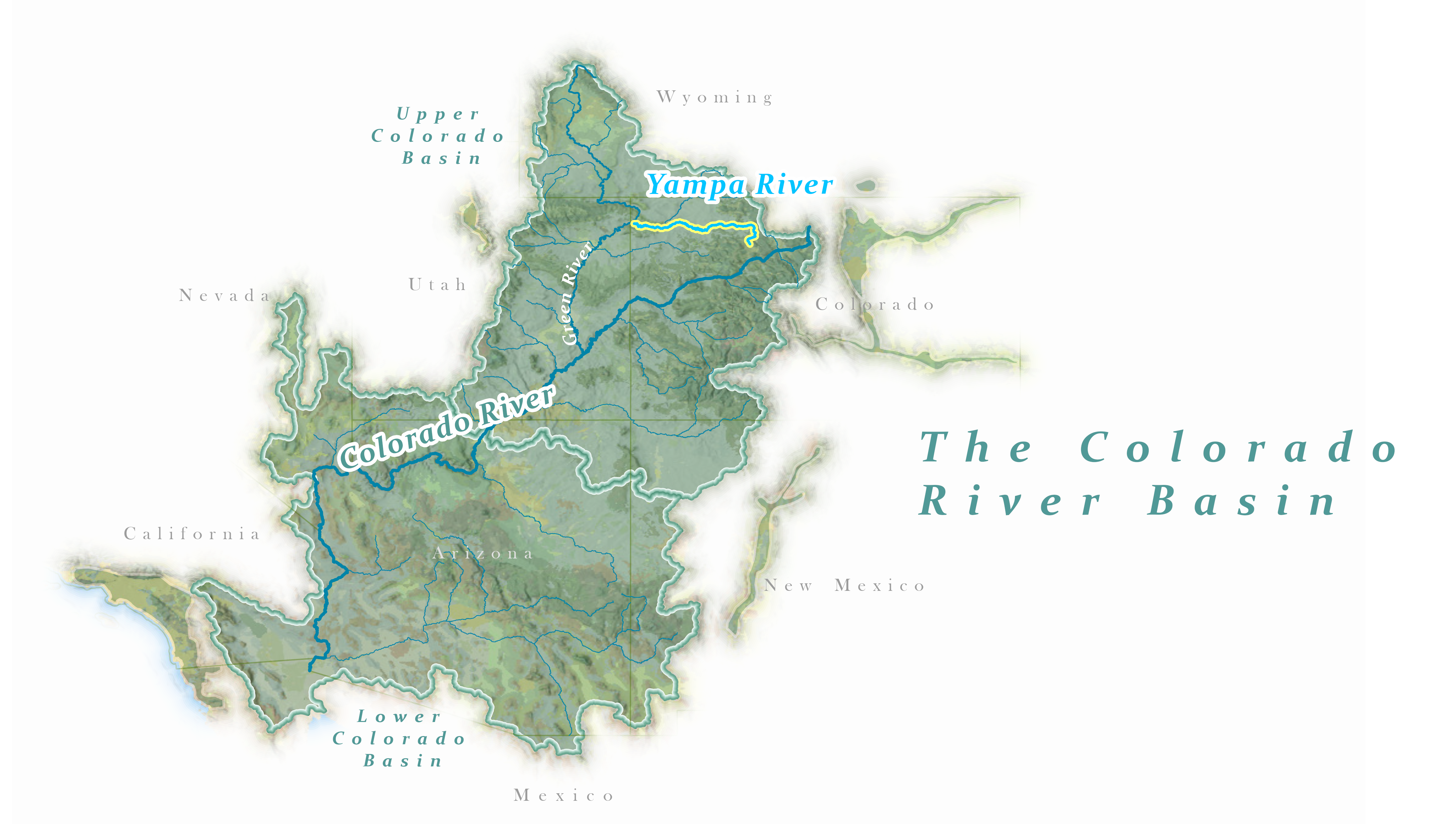
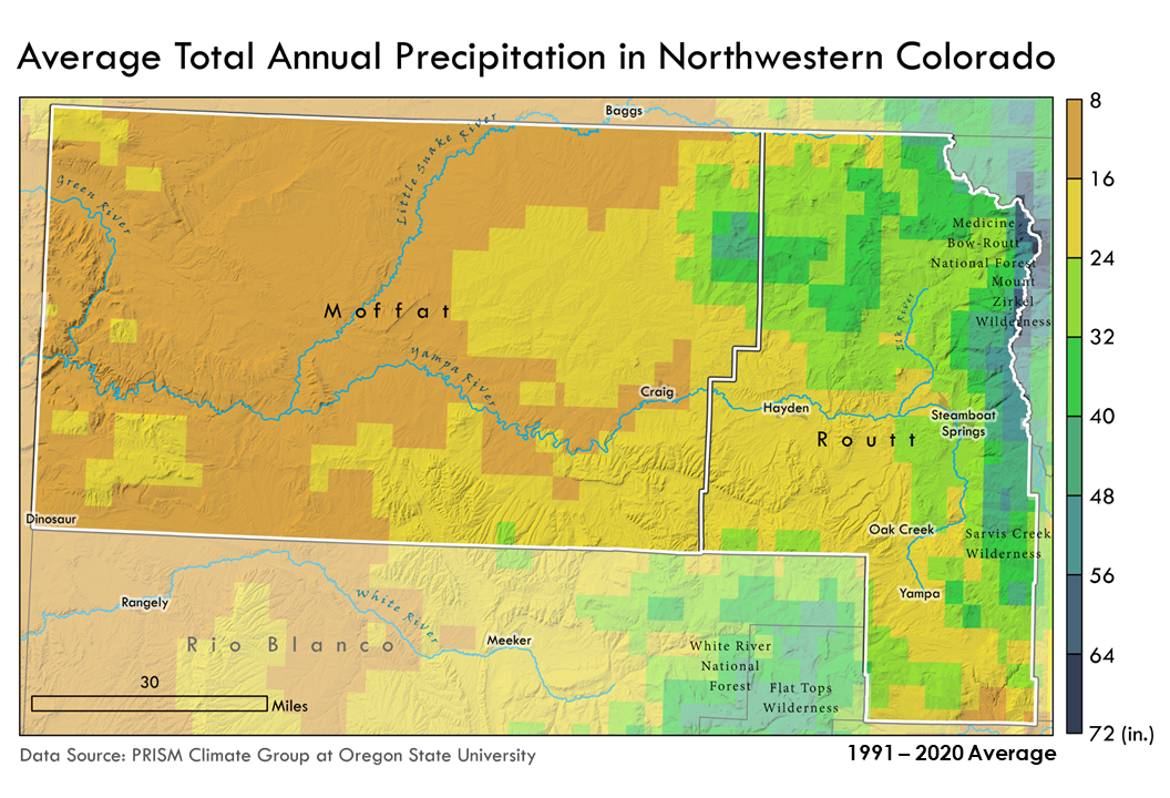
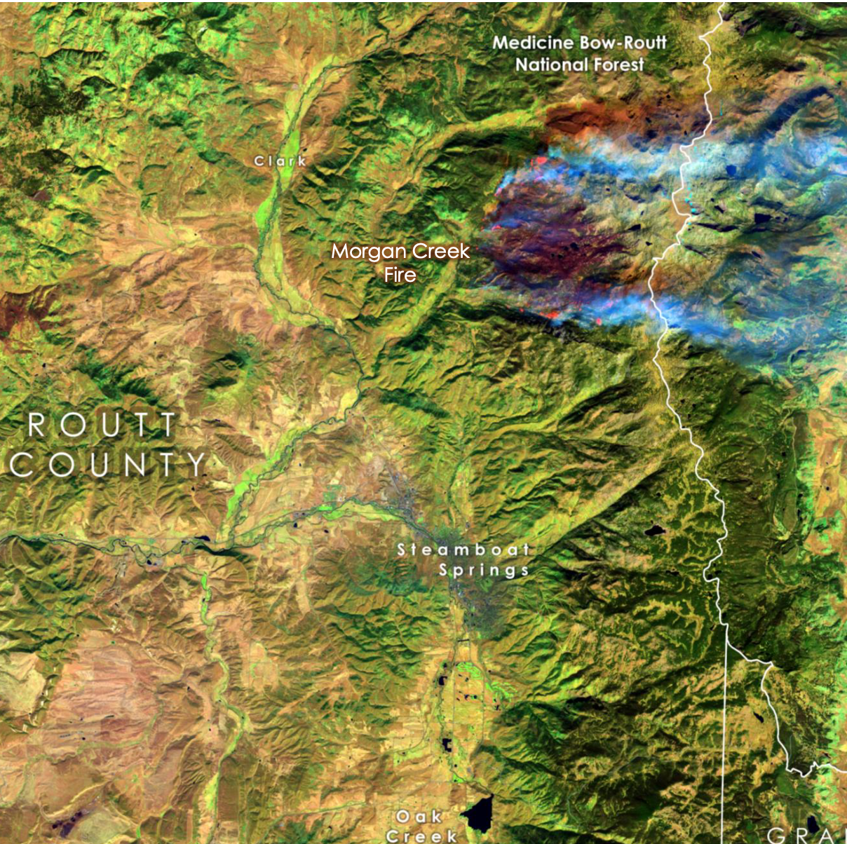
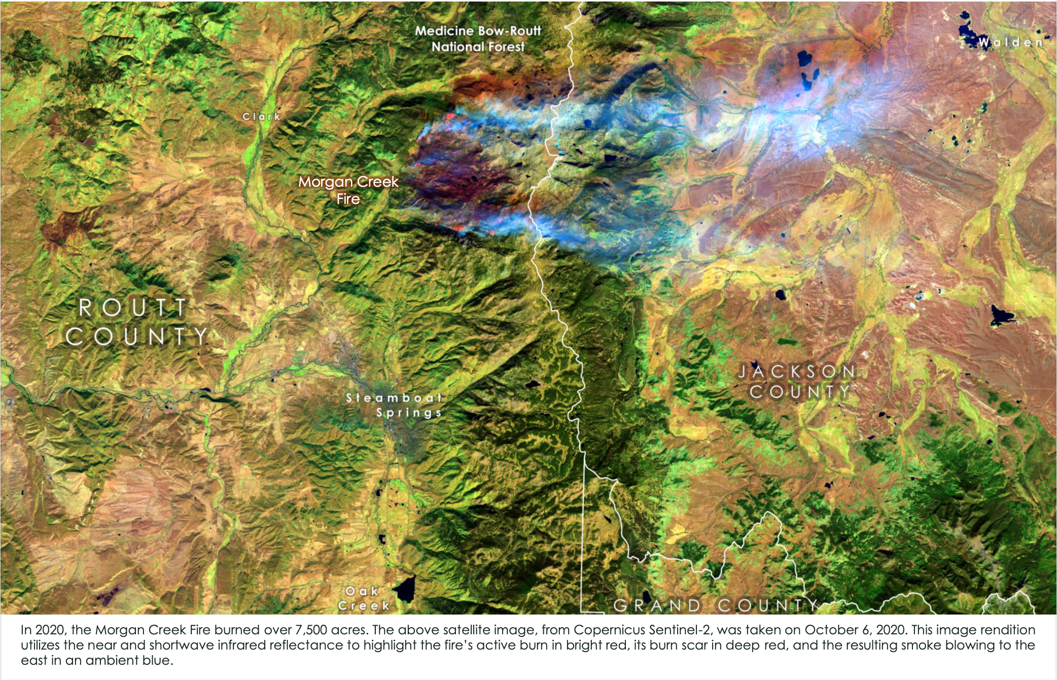
Created for Woodwell Climate Research Center. Data accessed via Google Earth Engine, map designed using ArcGIS Pro & Maps for Adobe.
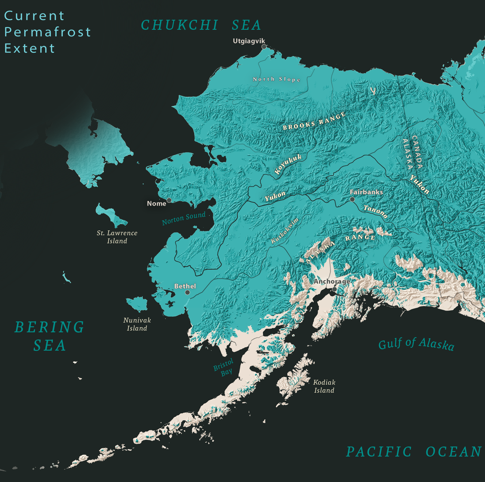
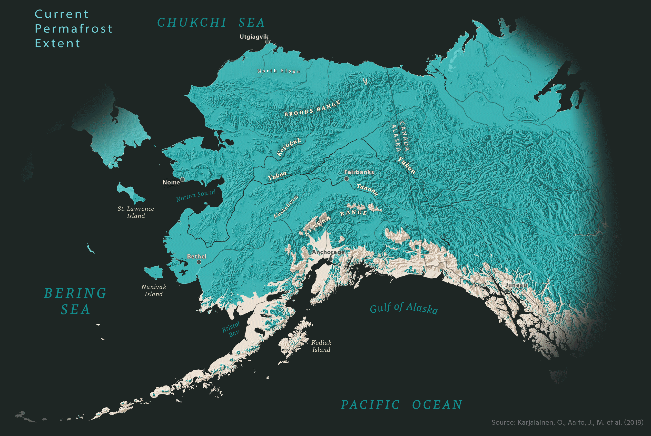
Created for Woodwell Climate Research Center. Data accessed via Google Earth Engine, map designed using ArcGIS Pro & Maps for Adobe.
Data Viz
Interactive Visualizations
Infographics
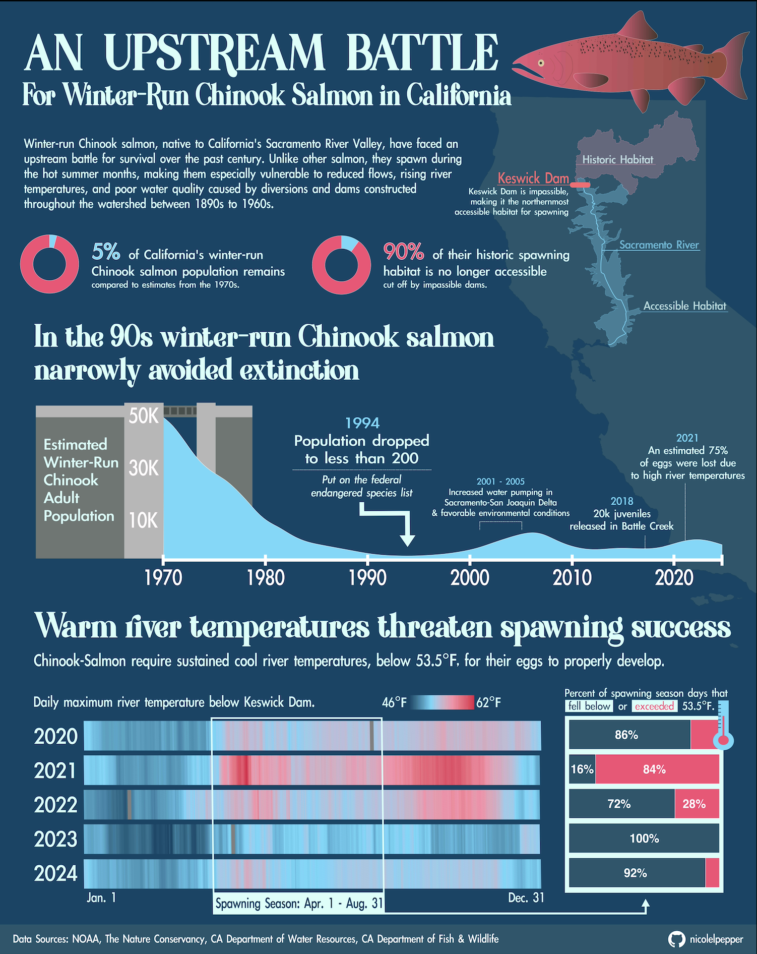
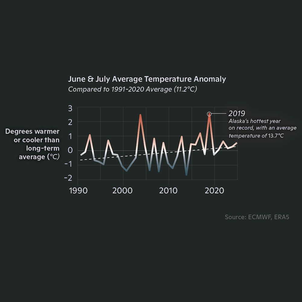
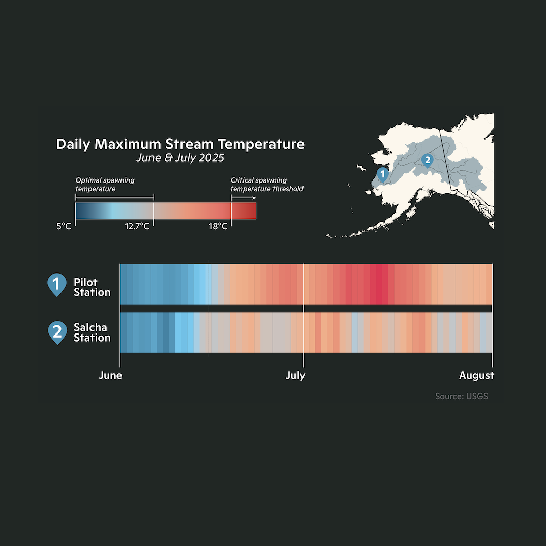
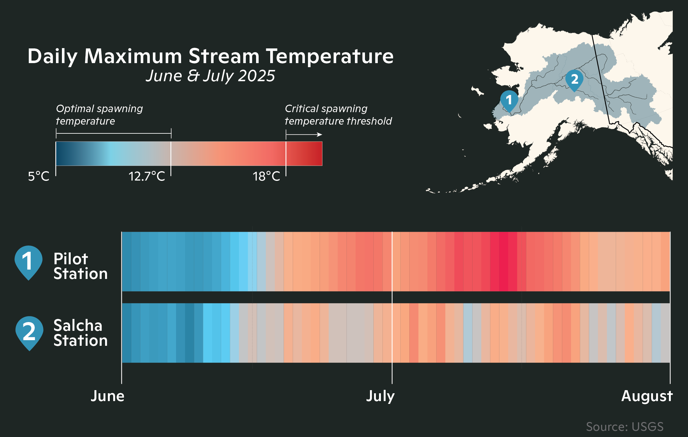
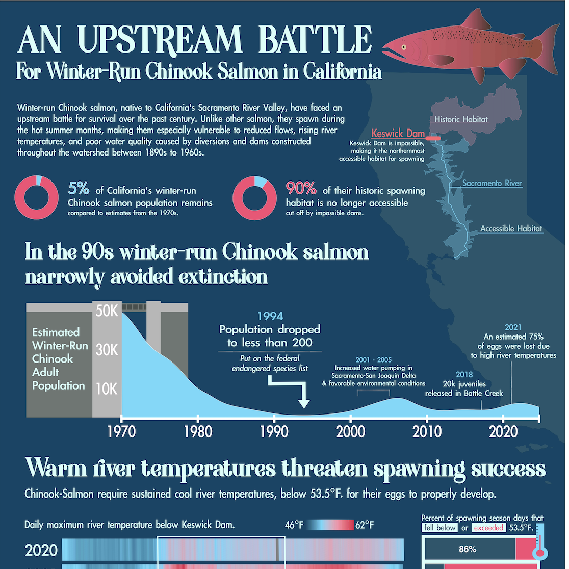
Winter-run Chinook salmon narrowly avoided extinction in 1990s. While their numbers have made a slight recovery, their upstream battle continues as they face ongoing threats like warming rivers and habitat loss. Keeping rivers cool is one of the most critical ways to protect them. Designed in R-Studio and Affinity.
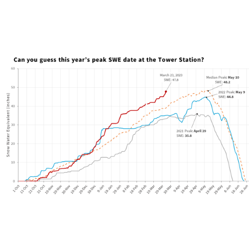
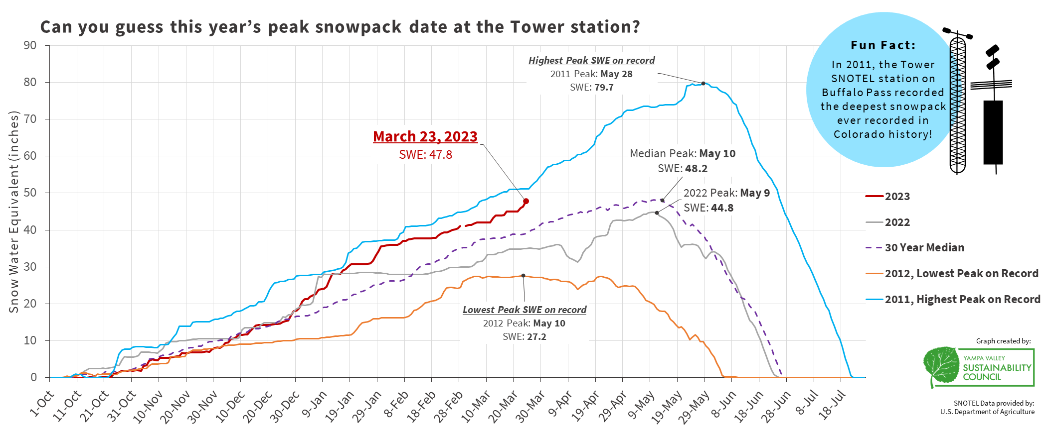
This is an infographic that provides an overview of the benefits of healthy riparian areas and provides three simple tips for how homeowners can help protect and enhance them. I created this to support a riparian health initiative by Yampa Valley Sustainability Council. Designed in Adobe Illustrator and Canva.
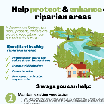
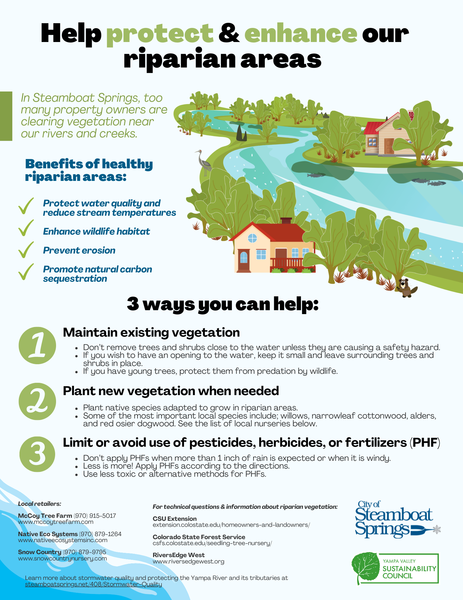
This is an infographic that provides an overview of the benefits of healthy riparian areas and provides three simple tips for how homeowners can help protect and enhance them. I created this to support a riparian health initiative by Yampa Valley Sustainability Council. Designed in Adobe Illustrator and Canva.
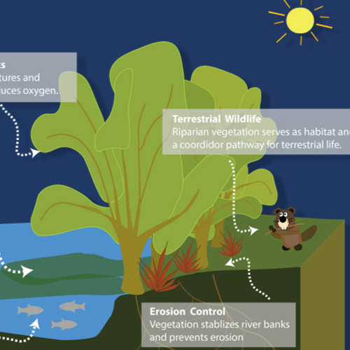
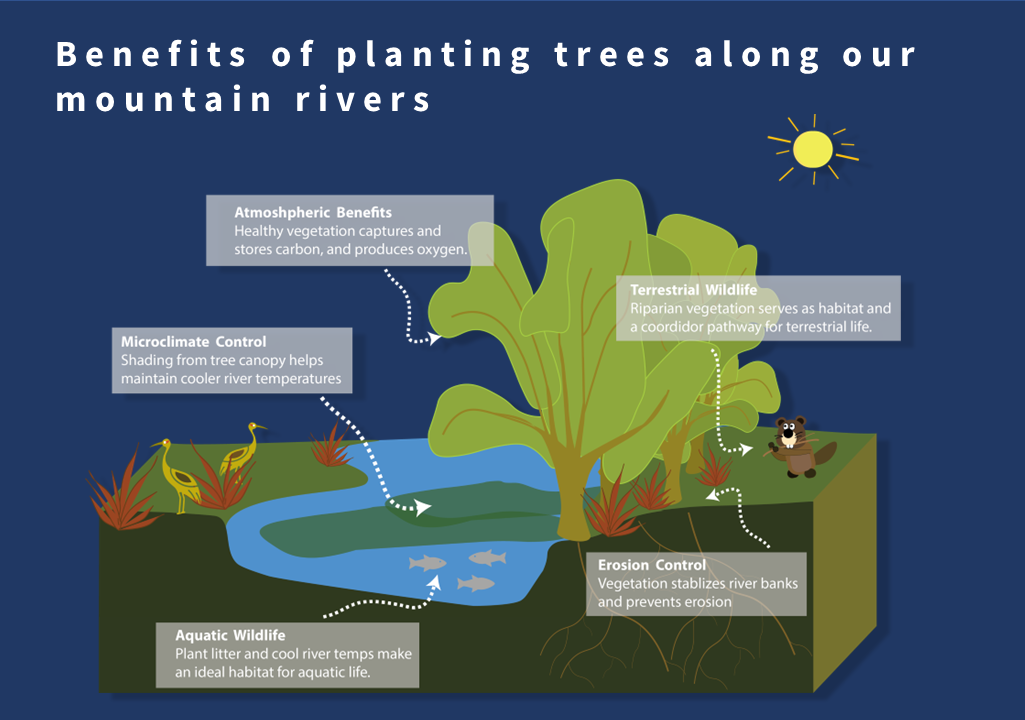
This is an infographic that provides an overview of the benefits of planting trees along rivers. I created this to support an initiative of the Yampa River Forest Restoration Project led by Yampa Valley Sustainability Council. Designed in Adobe Illustrator.
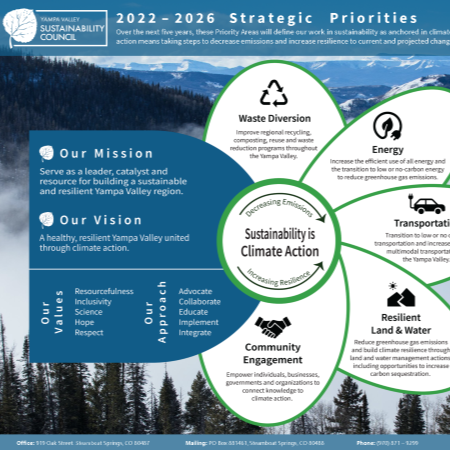
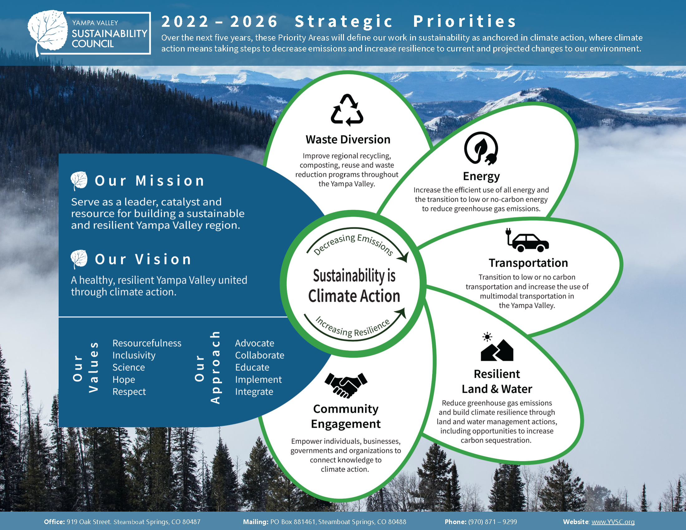
This is an infographic that provides an overview of the 2022 - 2026 Strategic Priorities for Yampa Valley Sustainability Council. I designed this to support their 5-year strategic planning process. Designed in Adobe Illustrator.